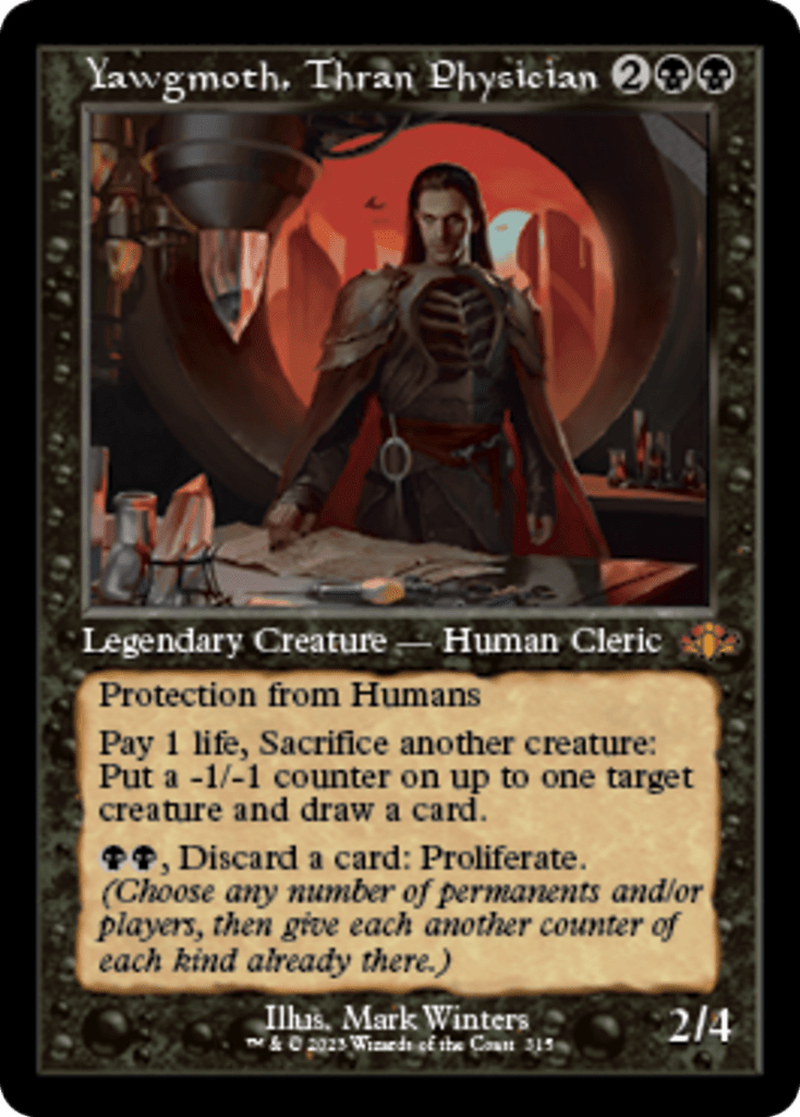
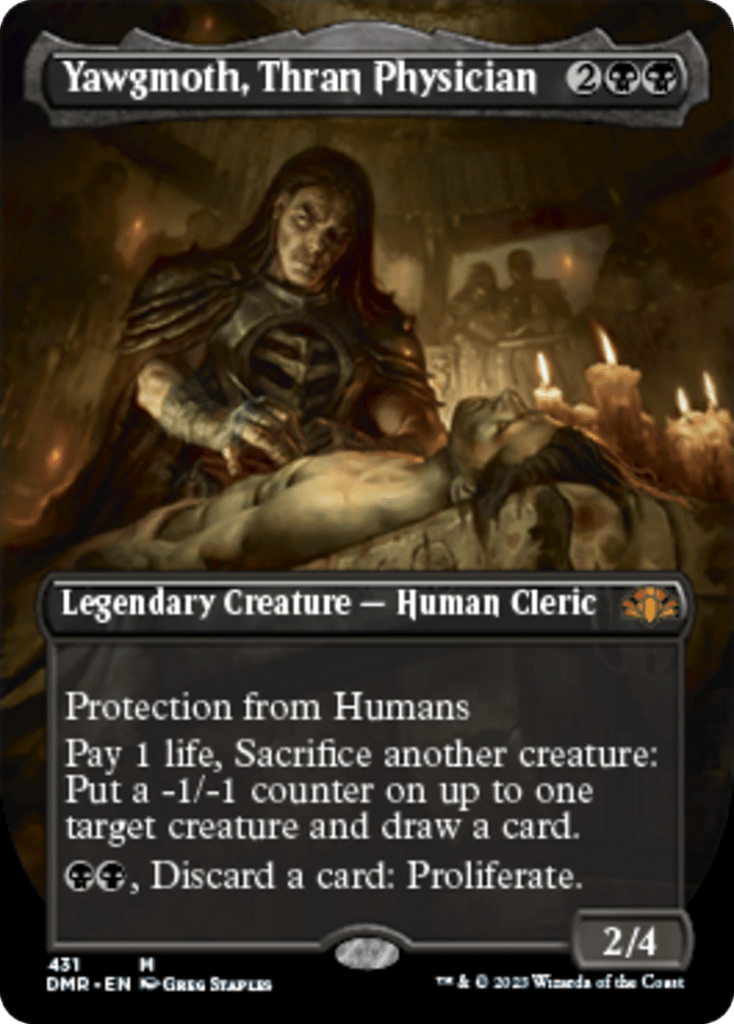
Magic sets from 2021 onwards have regularly included a retro frame variant. They have been well received but I will admit that I am not among those. In fact, I will gladly choose the more recent frame version over the retro one if given a choice.
What is now called the retro frame is in fact the original frame that Magic launched with back in 1993. Though some changes were made over the years, such as color-coding the expansion symbol to reflect the card’s rarity or the introduction of a collector’s number (both changes introduced with Exodus), the frame stayed unchanged for a long time. It was only in 2003 with Eighth Edition that WOTC made significant changes to the frame. Among these was a new title bar and a new font called Matrix Bold replacing the original Goudy Medieval. Perhaps WOTC felt that the set released to celebrate Magic’s 10th anniversary was the right one to introduce such a significant change.
While a few tweaks followed, this Modern frame remained in use until Magic 2015 came out in the summer of 2014. This new frame, called M15, introduced a new font as well as the holofoil stamp, tweaks to the collector information and other smaller changes. This is the frame that we are now used to seeing when we crack new packs. Much like previous frames, it has also gone through some adjustments since then. WOTC has more recently also introduced alternate frames such as the extended art and borderless version.


You can see above Lyra Dawnbringer in the original frame, the M15 frame and the more recent borderless frame.
So why am I telling you about these frames? Because, as I said at the very start of this post, I’m not a fan of the recent trend to reprint cards in what is now called the retro frame. Before I tell you why, know that the boys and I started playing in 2015 around the time of Battle for Zendikar. The first packs we opened and the ones that triggered our love for this game used the M15 frame. Also know that I’m not a spring chicken anymore and had to start using reading glasses a few years back. You can probably see where this is going.
So why do I dislike the original frame? A few reasons.
The first is simply legibility. Look at any retro frame cards in this post and I suspect that you’ll agree that legibility is pretty bad. It’s not just a computer screen issue, the same is true for physical cards as well. It’s also not just a matter of white text on a light background either. Urza, Lord High Artificer and Yawgmoth, Thran Physician (see below) suffer from the same issue, albeit somewhat less due to their darker backgrounds that improve the contrast.


The second reason is that the newer layout is clearer. I know that this is probably more of a personal preference but I like that the different information is neatly boxed. For example, Power and Toughness have their own box. The same with the card name and mana cost. It’s a small thing but one that again improves readability.


The third reason is the amount of information on a card. The new frames add some new information that is often useful. The card number and set code are two such additions. With cards now getting multiple variants, the card number is definitely useful in helping identify some of these.
Feel free to chime in the comments and let me know if you agree or disagree.
Note: I pulled some of the information on the changes over time to the Magic card frame from the MTG Wiki.
You must be logged in to post a comment.